Session 2- Critical Analysis
Ahead of this session we were asked to bring in 2 images of Graphic Design that we consider good design and 2 that we consider bad design.
These were my images :
Bad Design:

4th november 2012
The reason i dont like this piece is that although there has only been two fonts used, itlooks too much due to tge fact their are a mixture of weights and thicknesses.
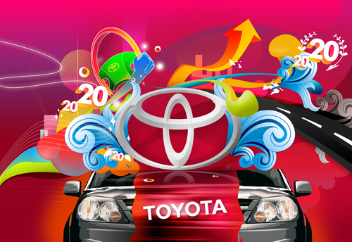
4thNovember 2012
Theres too much going on in this image and the use of so many colours over powers what its trying to promote which would be the Toyota car. I think it looks tacky and cheap just with the shapes and vibrancy of the image. I also dont understand the relevance with the number 20 and the slanted text, surely there is corporate protection with the use of logos to keep the design the way it was designed and by slanting it it is going against the design principles.
Good Design:

4th November 2012
-Quirky, quite a playful piece using a well known superhero that is well recognized
Colourful,Creative
There was a range of characters that i looked at wich were all to a high creative standard

These movie posters are simple but they show there visual communication by having a movie and filling the shapes with text of lines from the film.
Subtle but effective
Within out groups we spread out coices on the table and we changed to a different groups tables and chose and seperated which ones we all thought were good and bad, then we went back to our own images and looked to see what others considered good or bad. Everyone either had t.hem all correct or one or two that were in the wrong sections which shows that we all know and agree on what we consider good or bad with out even realising it.
We then got into partners and chose one image each to talk about it following the DIET process
D- Describe
I -Interpret
E-Evaluate
T-Theorise
I chose the circled super hero image above, and this is what i said:
Describe
-Layout is off a circle broken up into segments to display a child like image of a well known and recognizable superhero
-Symplistic, Flat colours, no shading to emphasise the cartoon visual
-Inside lines are straight only curved lines are only around the edge to create a circle
-Humourous, Quite funny because you recognize something round and circular to represent fat and everyone knows superheros arent fat so its quite ironic.
-Uses quite literal designs to create the image for example the 'S' sign and the curly hair even though its not at all realistic at all, it still strangely has features that represent superman in the film so visually it is spot on
Interpret
-This image i believe to be about is to create a humourous cartoon image of a circular superhero
Evaluate
-Ironic, representation of a superhero, Light hearted, fun-not serious, superheros arent necessarily serious
Theorise
Background should be a block colour, when background is textured, clashes with the flat colour of the pattern. text added giving it a point, whereas at the moment its just a illustration
This was my partners image:

Describe
-An image that has a mixture of symbols and tools
-Uses only three colours in a sense, blue,black outline and white background
-Quite childlike images in that they arent very detailed and kept to a minimum
-Quite full of information, a little too much info that it looks confusing
-Even though the design is busy but has simplistic imagery within its quite full of intricate details
Interpret
Hard to say really what i think this piece means, maybe the life of a builder being quite hectic and full and busy
Evaluate
Well balanced-shapes, size forms, colour, simple style works well throughout. Scale affects how it looks
Theorise
If you didnt know the meaning which i didnt its quite hard to grasp the concept, needs more icons regarding facebook if thats what its for, about development
D -colour, image/type, typeface, legibility,skill level, layout,composition, format, media, form, process- Point of agreement: Skill level, legability- Object
I -Legibility, skill level, function, meanings, concept, communication, tone of voice- Subjective Response
E -Effectiveness, communication, visual quality, easthetics, fulfilled its purpose, legability, based on everything, Subjective Response-Be aware of all aspects, Idea, Concept or purpose?
T-
- layout
- colour
- context
- function
- visual content
- non-visual content
- composition
No comments:
Post a Comment