Tuesday 27 November 2012

OUGD405 Design Process 'What is Research?' Part 1

'Process is more important then outcome'
When the outcome drives the process we will only ever go to where we've already been. If process drives outcome we may not know where we're going, but we will know we want to be there.' - An incomplete manifesto for growth- Bruce Mau Design in 2006
Design doesnt just straighten and clarify the world, it reflects the world as its ventures beyond...
 
Research Theme: Being Confident (group 7)
Definition of Confident:
Marked by assurance, as of success.
Marked by confidence in oneself; self-assured. 
Very bold; presumptuous.
Obsolete Confiding; trustful.
Full trust
Belief in the powers
trustworthiness
reliability of a person
belief in yourself and your abilities
Assurance/ Reliance. Back Bone
boldness
brassiness
What is confidence?
Confidence is simply your strength of belief that you can play the shot you want. Have enough of it, mix it with passion and skill, and your belief turns into KNOWING – or what I call congruence. There are two types of belief that determine your confidence level:
a) Global beliefs about yourself as a person or “self belief” – eg “I am …” statements, such as “I am naturally talented/athletic/a great learner/…”
b) Specific beliefs about your ability to play certain shots – eg “I can…” or “I’m good at…” statements, such as “I can drive/putt/chip/play bunker shots really well”
Both types of belief create or destroy your confidence, depending on how they make you feel. For example believing “I’m never good enough” would stop you from using all of your skills during shots and would cause endless dissatisfaction after them too – not too good for confidence!!!
http://www.singlemindedgolf.com/index.php/blog/articles/113-confidence 28th November 2012


Things you need to be confident for:
 
Public Speaking
Socializing
Personal Confidence/Self Confidence
 
What makes you confident:
-Past Experiences-Bullied through the child hood-Knock Backs-Upbringing
-Psycological-Institutionalized
-Role Models- Parents- Family- Friends-Celebrities
-Body Language-Eye Contact- Shy away- The way you walk- How you act
 
 
How you can become confident:
-Councilling
-Talks
-Videos Online
 
Being Confident Themes to research:
-Psycology-Experiments-Wh they lost it
-Improving Confidence- How to boost your confidence
-Apearance- Plastic Surgery- Clothing
-Body Language
-Role Models/Media-Parents, Family, friends, celebrities
-Inner Confidence(not appearance)
-Confidence in other people
 
My theme- Improving Confidence/Inner Confidence
Improving Confidence
Online
Books
Tv Shows
Psycological
Socialising-Events to meet people
People relying on substances(alcohol,drugs) to give them confidence
People who physically cant leave their house
Extreme Cases
Being Confident
-Extreme Cases
Phsycological
Bad
Substance
Good
Medical
Physical Appearance
-Judgement
-Clothing-Fashion
-Body modification
-Media Influence
Role Models
Family Influences
Famous influence
Media
Good
Bad
Body Language
Posture
Myths
What defines it
Genetic/learnt behaviours
 

OUGD401 The context of Practise

Could it be argued that fine art ought to be assigned more 'value' than more popular forms of Visual Communication?

Bibliography of books that i may find useful:

Fabella,T & Edwards, D, 2000, Graphic Idea Resource: Identity, building image through Graphic Design, Rockport Publishers, Classification 745.25
The reason i chose this book as I wanted to look at and find info on Graphic design that would help me compare the two art forms to the best of my ability. This is one type of Graphic design that plays a big part in the subject, it is also probably one of the most common pieces of Graphic Design that the general public would normally see and not recognize as graphic design.

Sidles, C, 1999, Printing: building great Graphic Design through Printing techniques, Massachusetts, Rockport Publishers, Classification 741.6 (Vernon Street)
Printing techniques could be taken into fine art and plays another big part of graphic design therefore to look at the importance of it with graphic design would be an interest concept to take as it is a mixture of both Graphic design and Fine art.

Gomez, E, 1999, New Design: London: The edge of Graphic Design, Massachusetts, Rockport Publishers, Classification 7416.04
I wanted to also look at modern contempary graphic design that would be interesting to see the contrast between that and modern contmporary Fine Art.

Kosner, J, 2004, Motion Graphic design and Fine Art animation: Principles and Practise, Oxford, Focal Press, Classification 778.5347
I wanted to maybe find a book that would contrast the two and see the comparisons and the differences however this was the only book that was available in the library that related to what i wanted. Even though it is about motion graphics and fine art animation it still shows the comparisons on some level.
Samara, T, 2012, Drawing for Graphic Design, Beverly, MA : Rockport Publishers, Classification 741.6 (Vernon Street)
Majority of people think that art is just drawing when in actual fact it has all different types of differences to it, and primarily a lot of people think fine art is drawing so i thought it would be interesting to look at a book that shows drawings for Graphic Design.

Monday 19 November 2012

OUGD401- Context of Practise- Beauty Style and Taste

Aesthetics

Colour, Layout, Visual Quality

Aesthetic Words

               :)
  • Simple
  • Clean
  • Crisp
  • Neat
  • Intricate
  • Eye-Catching
  • Bold
  • Striking
  • Detailed
  • Legible
  • realistic
  • Emotional
  • Dynamic
  • Complimentary
  • Minimalist
  • Memorable
  • Structured
  • Geometric
  • Distinctive
  • Powerful
  • Modern
  • Sophisticated
  • Balanced
  • Proffesional

               :(

  • Tacky
  • Overworked
  • Over- Coloured
  • Bad Layout
  • Clashes
  • Over the top
  • Plain
  • Emotionless
  • Unrealistic
  • Cheap
  • Generic
  • Garish
  • Cluttered
  • Overpowering
  • Busy
  • Messy
  • Unclear
  • Illegible
  • Misplaced
  • Common
  • Mediocre
  • Chaotic
  • Underworked
Visual Quality not Visual Response
We had to bring in examples of work that were
-Pure typographic image
-Image
-Type and Image
 The images in those categories had to be ones which we liked or disliked. These were the images i chose :


 Image I Like
http://www.visualnews.com/2012/08/22/circle-heroes-by-edzel-rubite/


Image I Don't Like
http://www.zazzle.co.uk/retro_van_graphic_design_poster_print-228224103444310549


 Typography Image I Like
http://www.mohawkcollege.ca/continuing-education/manatee-art-exchange.htm


Typography I don't Like
http://spacecollective.org/Chelsea/3943/typography


Type and Image I like
http://vi.sualize.u/spacializer_portfolio_of_empk_art_direction_and
_graphic_design_illustration_poster_red_picture_3kRv.html


Type and Image I Don't Like
http://www.zazzle.co.uk/retro_van_graphic_design_poster_print-228224103444310549


From these images we had to choose 3 and write 5 descriptive words from the list above that represented them

For the Image Picture i wrote
-Simple
-Bold
-Striking
-Minimalist
-Distinctive

For the Type and image i wrote
-Intricate
-Detailed
-Structured
-Modern
-Crisp

For the Type and image i dont like i wrote
-Tacky
-Overworked
-Garish
-Clashes
-Cluttered

We then had to choose 3 of the images and swap with someone in the class and write what we thought of them after looking at the word for 5 secs we wrote one word for looking at it for 10 seconds we wrote 2 then for looking at them for 20 seconds we wrote 3 words. We then had to decide as to wether this person liked that image or disliked the image.


I correctly guessed my partners likes and dislikes within this image however none of them id of chosen that i liked myself.

After doing these tasks we were asked to make 10 rules that makes good design:
  • All Graphic design needs to legible
  • All Graphic design should be engaging
  • All Graphic design should have a purpose
  • Complex Graphic Design should be clean
  • Colours should be appropriate to conetent
  • Aesthetically appropriate to the certain audience
  • When mixing media it needs to be appropriate
  • Dont overwork it
  • Dont allow the typeface overpower the message
  • The communication and message getting accross should be clear and concise
 We then asked to choose two images from our table that didnt belong to us. These are the images that i chose:
Image 1
Image 2
 As these images do not belong to me i do not have the links for these two images

 Why do these two images fulfill or not fulfill your aesthetic needs?

 Image 1 i find quite amusing, it is quirky, simplistic and humourous the way the bee is attracted to flower without it being too literal. Literally using a few shapes and the space around to create the illusion off a bee. Its clear and concise and the colours used are appropriate. Whereas image 2 doesnt fulfill my aesthetic needs and what i look for in a good piece of Graphic design. Even with the extensive overuse of colours i still find it bland. The colours have no meaning there doesnt look to be a theme and i find that the fact it has a lot of wording taking place makes it look even more cluttered then neccesary jsut because of all the colours but as well the way the sizes of the fonts gets smaller makes it obvious that they have done it so it all fits on one design. It is just the opposite to the first too cluttered and not clear enough. There is no clear message as the layout is all over the place it doesnt look structured even though some text has coloured boxes around just adds to the look of it looking cluttered.

Friday 9 November 2012

OUGD403: Design Principles Crit on Message and Delivery

Friday 9th November 2012
During this session we got seperated in to two groups, one group placed there three finished posters on tables and whilst they left the room the other group had to come in and write about 3 different posters. This way we could tell this person the truth without feeling worried about what they would think as it was annonymous. I found this a lot easier to write what i thought rather then telling this person as it was more tuthful and same goes for when reading about them. I knew they were the truth rather then a personal attack on you. So this was very beneficial to me.
Below is what was said about my posters by three different people:
What Statement/fact/question is being communicated to you
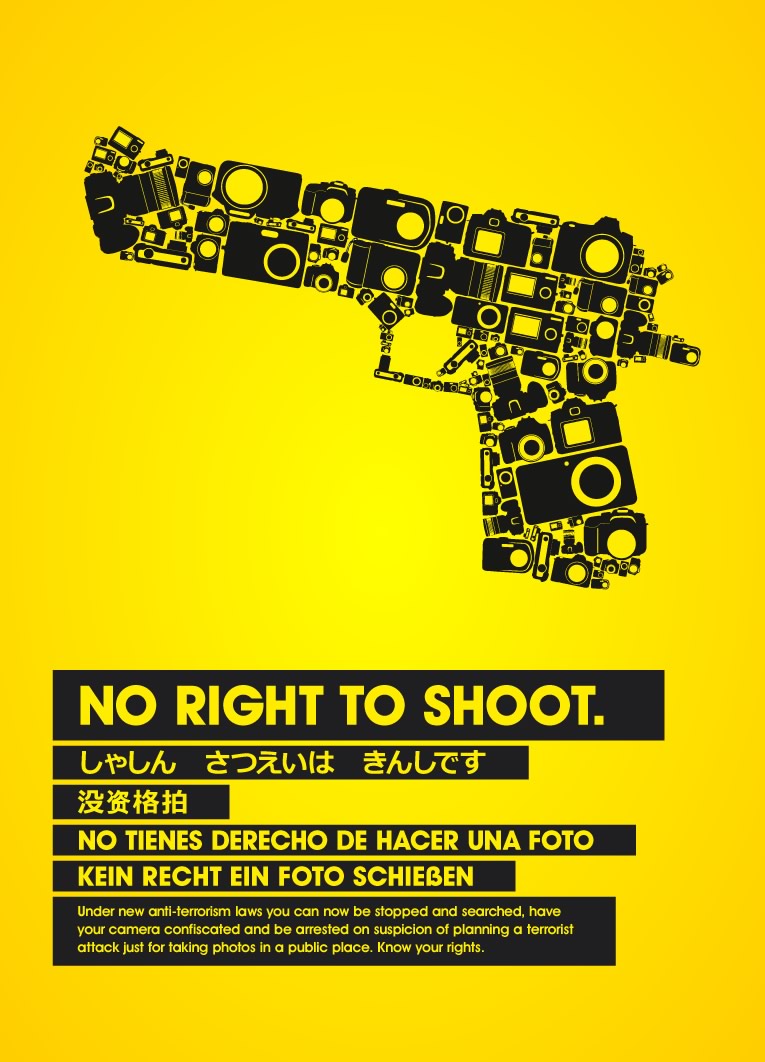
Student 1-End terrorism
Student 2-  Stop terroism
Student 3- End terrorism
Is this being communicated in a clear and focused way?
Student 1-Yes
Student 2- Yes
Student 3- Yes
What could be developed further?
Student 1- I feel more experimentation could be shown into the layout of type poster and type and image poster. Like how the image poster has been cropped
Student 2-  I think the positioning ot the text needs to be edited, it conveys a clear message, it's just in some areas its hard to decide which word is next to read
Student 3- Perhaps the image could have been played with a little more e.g mixture of the bomb and peace sign.
Have the posters been kept "Simple and to the point"
Student 1-Yes
Student 2- Yes
Student 3-Yes
Is a Statement, fact or question being posed?
Student 1-Statement has been posed on type and type + image poster using type and the imagery used such as 'peace' sign and bomb symbol convey this message on image poster
Student 2-  I believe a question is being posed, the poster asks to 'help' Its also posing a statement i guess by telling you that the war on terror needs to stop
Student 3- Statement. The words and language is an opinion
Has the restriction of two colours been met?
Student 1- No
Student 2-  No
Student 3- Yes
Are the two colours plus stock appropriated to the sollution?
Student 1-Unsure
Student 2- Yes
Student 3- Yes
Why are the two colours plus stock apropriate/inappropriate?
Student 1- I like the use of red for the word 'terrorism' it links in with the idea of danger and is associated with stop- Which is appropriate for 'stop terrorism'

Image and type+image poster used 3 colours and stock

Student 2- The red works really well to portray the violence. the light blue is a nice, calm peaceful colour which calms the whole piece down
Student 3- Perhaps you could have considered your stock, however it hasn't changed the effect of your poster massively. Colours are strong and represent your themes of terror, danger, stop and calmness. Well its very clear also white for peace 
Do the posters work as a set or a series?
Student 1-Yes
Student 2- Yes
Student 3- Yes
Why do the work/dont work as part of a set or series and could this be developed further?
Student 1-Pease symbol has been used on each poster and similar colours have been used.
Student 2- They all work really well. Maybe make the image poster more clear ! but I really like it
Student 3-The colours match, the layouts also similar, perhaps should have been the same size e.g column width. Peace sign links them altogether, and peace is the main message.
Is it clearly evident which poster is TYPE, IMAGE and TYPE &IMAGE?
Student 1--Yes
Student 2-  Yes
Student 3- No as both your posters with type on have a peace sign, this is an image but it does link the, all together which is good.
Are the posters "memorable, immediate high impact and clear?"
Student 1- Bold typeface used works well and makes an Impact

I like the layout used on image poster, cropping the 'Peace' symbol is interesting

Student 2- Yes very. The colours are brilliant and really stand out. I think using the word 'fight' should be swapped if your to stop terrorism and violence
Student 3-I think they all are memorable especially the ones with the type. high Impact because of the red and they are very clear
Do you feel the brief has been fullfilled to its full pottential?
Student 1-Yes
Student 2-Yes
Student 3- Yes
Further Feedback:
Student 1-Posters show deep research into the subject
Student 2- Clear and to the point
Student 3- An informed opinion, made a judgement, good colours which are symbolic, typeface is good, except on 'War' it should of all been uppercase as it doesnt match the rest of your typeface.

My Opinion

I am very grateful for these comments as it brought to light somethings i hadnt realised and given me ideas to maybe tweak my designs.
On screen my designs had a grey background which was my stock colour however when i printed them out they came out a pale blue and unfortunatley i didnt have enough time to rectify this, so when it came to the crit it was made clear that i hadnt used the write amount of colours.
Also as said above i used an image in my type poster which i will rectify and take that out for my final pieces.
As brought to my attention i will also re word some of my work as i dont want to promote violence and as a student correctly stated writing the word 'fight' is confusing to the audience as it would seem to be promoting the violence when im wanted to get accross to stop it.
Overall i am happy with my final pieces and pleased with what my fellow students had to say it has really been beneficial to get a truthful opinion on my work and informing me on ways i can improve them.

Sunday 4 November 2012

OUGD403 Message and Delivery:Research

Create a body of research on responses to a story, issue or theme found in the national press tomorrow, Tuesday 23rd November

There was a story that came out on this date about three men who had planned a terrorist attack claiming that they are 'Like Four Lions-But there are only three of us' The Independant 23/10/2012
I chose this story because terrorism is something that everyone no matter what country you live in you are aware off, this story was in many of the news papers i looked at the articles i chose were from The Independant, Daily express and The Sun.
Article 1:The Independant


Article 2 : The Sun

 Article 3: Daily Express


I started to think broader so i looked up the word terrorism this was the meaning i got :

"Terrorism is the systematic use of terror, often violent, especially as a means of coercion. In the international community, however, terrorism has no legally binding, criminal law definition.[1][2] Common definitions of terrorism refer only to those violent acts which are intended to create fear (terror), are perpetrated for a religious, political or, ideological goal; and deliberately target or disregard the safety of non-combatants (civilians). Some definitions now include acts of unlawful violence and war. The use of similar tactics by criminal organizations for protection rackets or to enforce a code of silence is usually not labeled terrorism though these same actions may be labeled terrorism when done by a politically motivated group. Perhaps,[3] it is less oppressive in itself than through the effects of the precautions taken to protect its likely victims.[4]
The word "terrorism" is politically and emotionally charged,[5] and this greatly compounds the difficulty of providing a precise definition. Studies have found over 100 definitions of “terrorism”.[6][7] The concept of terrorism may itself be controversial as it is often used by state authorities (and individuals with access to state support) to delegitimize political or other opponents,[8] and potentially legitimize the state's own use of armed force against opponents (such use of force may itself be described as "terror" by opponents of the state).[8][9]
Terrorism has been practiced by a broad array of political organizations for furthering their objectives. It has been practiced by both right-wing and left-wing political parties, nationalistic groups, religious groups, revolutionaries, and ruling governments.[10] An abiding characteristic is the indiscriminate use of violence against noncombatants for the purpose of gaining publicity for a group, cause, or individual. The symbolism of terrorism can leverage human fear to help achieve these goals. [11]"
4th November 2012
I realised that everyone knows about terrorism from the news or from what they read in papers but there isnt actually many awareness posters, i know for a fact that in the town where im from and the ciy i am studying in i have never seen any. Even visits to london where there has been terrorist attacks there, there isnt any so i tgought this maybe could be a good route to go down. Below are some images of posters already made:
4th November 2012

4th November 2012

p://www.dipity.com/tickr/Flickr_terrorism/&docid=uXGXfHDH9Rqq0M&imgurl=http://static.flickr.c
om/3214/3063607409_de5c871403.jpg&w=500&h=356&ei=QL6WUJnzOqaq0QX1jYHYAQ&zoom=1&iact=hc&vpx=955&vpy=314&dur=3
86&hovh=189&hovw=266&tx=99&ty=77&sig=105276620682064124934&page=1&tbnh=146&tbnw=236&start=0&ndsp=20&ved=1t:429,r
:12,s:0,i:105
4th november 2012
4th november 2012


4th November 2012
4th november 2012
4th november 2012

4th November 2012

4th November 2012

 http://www.behance.net/gallery/Anti-Terrorism-Poster/4307661
 8th November 2012


Images about Human Rights

All images below are found on the same website with the same date

4th november 2012


Images about Peace

images below are found on the same website on the same date:
4th November 2012


OUGD404 session 1 Design Visual Literacy-The language of Graphic Design

Visual Literacy

The language of Graphic Design

Visual Literacy
-The Ability to construct meaning from visual images and type
-Interpreting images of the present, past and a range of cultures
-Producing images that effectively communicate a message to an audience

Visual Communication
- Is a process if sending and recieving messages used of type and image
- Is based on a level of shared understanding of signs,symbols,gestures and objects
- Is affected by audience, context, media and method of distribution

All that is necessary for any language to exist is an agreement amongst a group of people that one thing will stand for another

+   Plus, add, and, positive, first aid,cross christianity, religion, church without steeple (common understanding)
-Lacks understanding

+X
            Plus, context we have given it a mathmatical symbol
+=

Semiotics- Sign, Symbol,Signifier

Key Elements
Visual Language in Graphic Design
  • frame
  • format
  • figure/form
  • ground
  • composition
  • visual dynamics
  • type
  • image
  • cplour
  • layout
  • legibitlity
  • readability

OUGD404 Context of Practise Studio Task Critical Analysis

Session 2- Critical Analysis

Ahead of this session we were asked to bring in 2 images of Graphic Design that we consider good design and 2 that we consider bad design.
 
These were my images :
 

Bad Design:

 
4th november 2012
The reason i dont like this piece is that although there has only been two fonts used, itlooks too much due to tge fact their are a mixture of weights and thicknesses.
 
4thNovember 2012
 Theres too much going on in this image and the use of so many colours over powers what its trying to promote which would be the Toyota car. I think it looks tacky and cheap just with the shapes and vibrancy of the image. I also dont understand the relevance with the number 20 and the slanted text, surely there is corporate protection with the use of logos to keep the design the way it was designed and by slanting it it is going against the design principles.

Good Design:

4th November 2012
-Quirky, quite a playful piece using a well known superhero that is well recognized
Colourful,Creative
There was a range of characters that i looked at wich were all to a high creative standard
  These movie posters are simple but they show there visual communication by having a movie and filling the shapes with text of lines from the film.
Subtle but effective

Within out groups we spread out coices on the table and we changed to a different groups tables and chose and seperated which ones we all thought were good and bad, then we went back to our own images and looked to see what others considered good or bad. Everyone either had t.hem all correct or one or two that were in the wrong sections which shows that we all know and agree on what we consider good or bad with out even realising it.
We then got into partners and chose one image each to talk about it following the DIET process

 D- Describe
I -Interpret
E-Evaluate
T-Theorise
 
I chose the circled super hero image above, and this is what i said:

Describe

-Layout is off a circle broken up into segments to display a child like image of a well known and recognizable superhero
-Symplistic, Flat colours, no shading to emphasise the cartoon visual
-Inside lines are straight only curved lines are only around the edge to create a circle
-Humourous, Quite funny because you recognize something round and circular to represent fat and everyone knows superheros arent fat so its quite ironic.
-Uses quite literal designs to create the image for example the 'S' sign and the curly hair even though its not at all realistic at all, it still strangely has features that represent superman in the film so visually it is spot on
 

Interpret

-This image i believe to be about is to create a humourous cartoon image of a circular superhero
 

Evaluate

-Ironic, representation of a superhero, Light hearted, fun-not serious, superheros arent necessarily serious
 

Theorise

Background should be a block colour, when background is textured, clashes with the flat colour of the pattern. text added giving it a point, whereas at the moment its just a illustration
 
This was my partners image:


Describe

-An image that has a mixture of symbols and tools
-Uses only three colours in a sense, blue,black outline and white background
-Quite childlike images in that they arent very detailed and kept to a minimum
-Quite full of information, a little too much info that it looks confusing
-Even though the design is busy but has simplistic imagery within its quite full of intricate details
 

Interpret

Hard to say really what i think this piece means, maybe the life of a builder being quite hectic and full and busy
 

Evaluate

Well balanced-shapes, size forms, colour, simple style works well throughout. Scale affects how it looks
 

Theorise

If you didnt know the meaning which i didnt its quite hard to grasp the concept, needs more icons regarding facebook if thats what its for, about development
 
D -colour, image/type, typeface, legibility,skill level, layout,composition, format, media, form, process- Point of agreement: Skill level, legability- Object
I -Legibility, skill level, function, meanings, concept, communication, tone of voice- Subjective Response
E -Effectiveness, communication, visual quality, easthetics, fulfilled its purpose, legability, based on everything, Subjective Response-Be aware of all aspects, Idea, Concept or purpose?

T-

  • layout
  • colour
  • context
  • function
  • visual content
  • non-visual content
  • composition


OUGD401 Study Task 4

Modernist Graphic Design

 
4th November 2012
 
 
1.Why you consider this image to be modernist?
2.Is it succesful or unsuccessful?
3.Terminology in relation to the analysis introduced in the session?
4.Quote from the essay by Massimo Vignelli to back up Analysis?
4th November 2012
 Beck, Harry, (1933) 'London Underground Map'
1.Why you consider this image to be modernist?
2.Is it succesful or unsuccessful?
3.Terminology in relation to the analysis introduced in the session?
4.Quote from the essay by Massimo Vignelli to back up Analysis?
 
 
 4th November 2012
 
1.Why you consider this image to be modernist?
2.Is it succesful or unsuccessful?
3.Terminology in relation to the analysis introduced in the session?
4.Quote from the essay by Massimo Vignelli to back up Analysis?
 
 04 november 2012
1.Why you consider this image to be modernist?
2.Is it succesful or unsuccessful?
3.Terminology in relation to the analysis introduced in the session?
4.Quote from the essay by Massimo Vignelli to back up Analysis?
 
4th November 2012
 
1.Why you consider this image to be modernist?
2.Is it succesful or unsuccessful?
3.Terminology in relation to the analysis introduced in the session?
4.Quote from the essay by Massimo Vignelli to back up Analysis?


Post-Modernist Graphic Design


http://n-cruickshank1013-cts.blogspot.co.uk/2011/02/examples-of-post-modern-graphic-design.html
4th November 2012
Jamie Reid from the Sex Pistols Album Art work
1.Why you consider this image to be post-modernist?
2.Is it succesful or unsuccessful?
3.Terminology in relation to the analysis introduced in the session?
4.Quote from the essay by Massimo Vignelli to back up Analysis? 
 

http://n-cruickshank1013-cts.blogspot.co.uk/2011/02/examples-of-post-modern-graphic-design.html
4th November 2012
David Carson
1.Why you consider this image to be post-modernist?
2.Is it succesful or unsuccessful?
3.Terminology in relation to the analysis introduced in the session?
4.Quote from the essay by Massimo Vignelli to back up Analysis?
 
4th November 2012
 Barbra Kruger
1.Why you consider this image to be post-modernist?
2.Is it succesful or unsuccessful?
3.Terminology in relation to the analysis introduced in the session?
4.Quote from the essay by Massimo Vignelli to back up Analysis?

http://a-slippens1013-cts.blogspot.co.uk/2011/03/5-examples-of-post-modern-design.html
4th November 2012
Keedy, J (2002), 'Emigre Type Specimen Series Booklet No. 4 Keedy Sans'

1.Why you consider this image to be post-modernist?
2.Is it succesful or unsuccessful?
3.Terminology in relation to the analysis introduced in the session?
4.Quote from the essay by Massimo Vignelli to back up Analysis?
http://www.flintriver.co.uk/blog/?p=2080
4th November 2012
1.Why you consider this image to be post-modernist?
2.Is it succesful or unsuccessful?
3.Terminology in relation to the analysis introduced in the session?
4.Quote from the essay by Massimo Vignelli to back up Analysis?