Live Brief: Secret 7"
You need people to see your work and the essence of Graphic design is Communication. There is no value producing work for it to be placed in a draw. Often the best work or best ideas are the ones that people have see. You must get to use to distributing your work at the any available opportunity.
Secret 7" is a project that combines music and art. After their success in 2012 the team are back with a new line up of artists, a new set of tracks and a new charity partner.
Brief
Secret 7" are inviting creatives from around the globe to take inspiration from one of the tracks from the artists below and design an original 7 inch vinyl sleeve. The sleeve must not feature the name of the artist or title of the track.
Chosen Artist: Elton John- Bennie and the Jets
After looking and listening to all the tracks of the artists that were an option for me, I chose to do Elton John purely because in my eyes he is the most iconic. I knew the other artists but not as much as Elton John. I also knew that visually he would be the best one to portray. After listening to the song i decided to look at the lyrics first to see if the lyrics would spring any ideas.
Hey kids, shake it loose together
The spotlight's hitting something
That's been known to change the weather
We'll kill the fatted calf tonight
So stick around
You're gonna hear electric music
Solid walls of sound
Say, Candy and Ronnie, have you seen them yet
But they're so spaced out, Bennie and the Jets
Oh but they're weird and they're wonderful
Oh Bennie she's really keen
She's got electric boots a mohair suit
You know I read it in a magazine
Bennie and the Jets
Hey kids, plug into the faithless
Maybe they're blinded
But Bennie makes them ageless
We shall survive, let us take ourselves along
Where we fight our parents out in the streets
To find who's right and who's wrong
http://www.lyricsfreak.com/e/elton+john/bennie+the+jets_20046854.html
I then wanted to look at his previous album covers, to see how they had been portrayed and the style in which they had been done in. Below are various albums which I liked :
http://www.lyricsgather.com/album/E/636-ELTONJOHN-lyrics.html
http://en.wikipedia.org/wiki/Here_and_There_(Elton_John_album)
http://www.last.fm/music/Elton+John/Rocket+Man+(The+Definitive+Hits)
http://en.wikipedia.org/wiki/Elton_John_(album)
http://www.lyricsgather.com/album/E/636-ELTONJOHN-lyrics.html
http://www.lyricsgather.com/album/E/636-ELTONJOHN-lyrics.html
http://www.lyricsgather.com/album/E/636-ELTONJOHN-lyrics.html
http://www.lyricsgather.com/album/E/636-ELTONJOHN-lyrics.html
http://www.lyricsgather.com/album/E/636-ELTONJOHN-lyrics.html
http://www.lyricsgather.com/album/E/636-ELTONJOHN-lyrics.html
I made the assumption that the majority of these covers were designed for the view of being fun and colourful capturing the essence and style of Elton John, Its his style that he is known for. From this i did some research on what people thought of when they hear elton John. Below is a pie chart of the common answers that were given when it came down to visuals that they think of.
From these results it gave me idea that i could take this on and look further into them. Firstly I needed to look at these items that made him so well known for them. Even though these are represented within his album covers I wanted to look at other photos of him where it shows this.
http://pinterest.com/pin/30610472439264426/
http://pinterest.com/pin/22236591882159960/
http://blogs.babble.com/famecrawler/2011/01/24/elton-john-on-gnomeo-juliet-fatherhood-and-his-love-of-runaway-bunny/
http://pinterest.com/pin/37928821833745215/
http://pinterest.com/pin/291608144592213907/
http://pinterest.com/pin/510595676472902763/
http://pinterest.com/pin/68468856805759720/
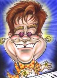
Looking at illustrations you can see that they have played with these key features aswell, from this i started thinking off ideas.
I also looked at previous entries of secret 7 just to see how other designers had portrayed there chosen artist with out using words.
Pete Fowler for DJ Shadow in 2012
This image inspired my own work, purely because this designer took note of this artists iconic items which would be his glasses, mustache and collors. I thought it is a really nice representation. I also think the style in which it has been done in is very inspiring. The way the use of black outline in contrast with the soft touches of the background detail with the detail in the sunglasses makes the features stand out.http://pinterest.com/pin/114841859218177319/


No comments:
Post a Comment