Wednesday, 14 January 2015

OUGD601 COP3 Evaluation

End of module self evaluation

Name: Sophie Abell

What skills have you developed through this module and how effectively do you think you have applied them?

With regards to the written side, I feel as if my writing skills and theoretical understanding has improved by extensive research. I realise the importance of using books for research purposes.  In respect to the practical side I feel as I have developed my web design skills as normally I try to avoid doing web design projects so by doing my whole practical side on web has been very eye opening and interesting. I would have liked to of physically produced the website however my skills in that area are not great at all so this could be something I could expand on in the future.

What approaches to/methods of your design development process?

I researched into already produced websites for inspiration, I also looked at websites that were similar to my own and quickly realised that all the sites done before had too much information and looked quite cluttered so I realised that for my website I wanted it to be stripped back and simplified, using simple imagery and not a lot of text.

What strengths can you identify in your work and how/have will you capitalise on these?

I think the strengths is the concept behind it, also as I wouldn’t normally design for web I thought that this was quite eye opening and I realise that although it needs work it is something that I can take with me in the future and improve. 

4. What weaknesses can you identify in your work and how will you address these in future?

The biggest weakness Is probably the fact that I didn’t produce the website, I wish I could have however admittedly I didn’t organize my time correctly and spent too much time on the written piece which left the practical side neglected. So in the future I will look into practicing building websites on Dreamweaver but also time management.


5. Identify five things that you will do differently next time and what do you expect to gain from doing these?

Time Management- I will make sure that I thoroughly plan my time effectively so I don’t neglect one project to the other.
Produce the website- I would like to produce the website using dream weaver so I would need to teach my self-how to use it so I can do this. I think it would have explained my idea better
Produce a design for different types of technology such as tablets and mobile. I only had desktop screen design in mind rather then mobile and tablet so this is something I would look into to develop my concept.
Research I feel as if again research has not been as thorough as it could have been If I had researched into different avenues more thoroughly then the end result would have been different.
Development I neglected the development side, when it came to the final design as a knock on effect from the time management or lack of, so equally if I plan my time right I will have more time to develop.

How would you grade yourself on the following areas?

 5=excellent, 4= Very good, 3=good 2=average, 1=Poor

Attendance                                4   
Punctuality                                4
Motivation                                 3
Commitent                                 3
Quantity of work produced  2
Quality of work produced     3

Thursday, 8 January 2015

OUGD601 CoP3 Practical


CoP3 Practical in relation to: 
How the Crowdsourced culture is challenging Traditional Graphic design practice

Synthesis:

After extensive research it became alight that crowdsourcing was a massive issue for designers. Some agreed with this method but the majority didn’t approve. For the designers who opposed crowdsourcing methods felt that it was de-valuing the design process and allowing clients to be in complete control. After researching into Crowdsourcing design websites it became apparent that these sites allowed the clients choose the deadline, the price and there was little communication between designer and client. It was evident that this method could be successful if certain things were to change. As well as this many designers did not agree with the method of designers doing work for a client without the notion or potential of getting paid.

Design2gether is a crowdsourcing website that is different to all the others. It enables the designer to gain control of the design process. It works by the client submitting a brief, very similar to the other crowdsourcing websites. However rather then the designer submitting to designs straight away, they are asked to submit a pitch. To create a decent pitch the designer would need to do there research thoroughly to understand what the client has asked for. As for previous websites they have shorter deadlines and ask the designers to submit ASAP. Cutting out the most important value when working with clients, which is communication. Creating the pitch method it not only allows for the designer to research but also communicate with the designer and also not doing work right away to the designer. The client benefits in this method due to the fact that they are guaranteed that the designer has thought through the brief putting the value back in to the design, because if the client was asking for a logo for their company, it would have thoughtful meaning. The client also is not left to look through 50+ designs which they may not be happy with, they are best of choosing the pitches themselves and if they are not happy with the end results then they can discuss that with the designer.

Within the pitches the designers would state how much they would like for this particular design as well as the deadline. For example a designer could have the deadline within that same day but may charge really expensive or a designer could have a longer deadline date and be really cheap. That is something that the client would have to weigh up when making their decision on who they would choose for the final stage into designing the finished pieces.

Once the pitches have been submitted and the client has chosen the pitches they would like to see the final imagery for it, the designer would be notified to complete the final. Once that is submitted the client would then have to look through and choose the winner. This process illuminates final pieces to be sent. Also as the process is a bit longer, the designers and clients involved get the notion that the work is not rushed or half heartened. Arguably putting the Value back into the specialism.

To conclude most crowdsourcing websites are client focused and a change needed to happen so that the designers feel as if they have a joint agreement within this process, which is just as important. If a client wants design using this method then they will get a design which is well thought through, well communicated which will result in getting what they want. If the designers were to sign up to this site then they will know that they are being well respected by the client who understands that if they want something that is designed well it takes time and communication to do this. Using this method does not mean that some can make a living off this process but it does encourage designers who have either self taught, students or even designers who are already in the industry to try something new and improve their skills and build a portfolio of work which they can be proud of.

Crowdsourcing Websites:

99 Designs:


Design Crowd:


CrowdSpring:


 Threadless:

Idea Bounty


48 Hours Logo:


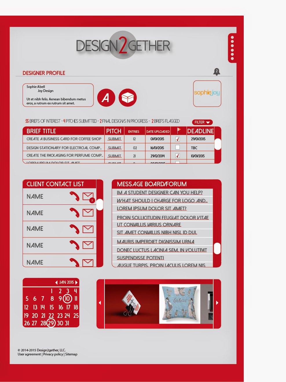
After looking at various websites to decipher which angle I was going to take with my practical piece, I realised that all these sites were catered to people who just wanted work, they didn't emphasise the attraction and benefits the designers would get. I decided that I would create a website for designers to get work rather then for a client to get a design. Design process was relatively straight forward, I wanted to make it simple, clean and appealing. The above examples all shove too much info in your face too soon, so I designed my website to have be of three colours primarily the red and grey. Using these colours made it look clean and professional but also appeals to both female and male designers.


I needed a name that didn't mention anything about crowdsourcing, not to deceive any body but purely because the connotations and views with crowdsourcing and designers are quite bad. As a website that focusses on Designers are there main audience which they are targeting it needed to be appealing to them. I decided on Design together, as a a way to encourage to designers that this is a process of working together, wether its working with other designers or working with the clients.
This a small section which shows my design process of the logo.. I originally thought about a hand rendered looking font however it just came out gimmicky so I kept it simple. The circle represents the world as a whole without being too obvious. 


User Journey as the designer, guest or client.


 Home Page


When the section at the right with the dots on is scrolled over or clicked it would open this side box. This box can be accessed on every page.
When these circles are clicked or scrolled over  there is a red ring that circles the button (If you click the client button it highlights with a grey circle.)

Log In page:


 Client Profile:


 Browse Briefs:


 When the buttons are scrolled over or pressed the circle will highlight in white,also there will be a drop down menu of specialisms that can be chosen.

Brief Page:

Designers Submission Page:


Client Profile Page: 


Submit Brief Form:


This is the page the client see's when pitches come through:


 How it Works:

About us: